


Lesson 034 - BTC/ETH On Chain Analysis
Glassnode Blockchain Data Analytics

My motivation and mission:
Google sheet that contains list of all WCD lessons and links to all content:
Lesson reviewing how to use Google sheet:
In Lesson 034 I will be reviewing how to utilize blockchain data analytic services such as Glassnode to discern key-market insights on cryptocurrencies.
People to Follow
The people below have risen to be the most-trusted sources of on-chain analytics. They both have a large Twitter following where they post free insights and their own Substack subscription where they post comprehensive market updates on a regular basis.
I personally have a T-2 Glassnode subscription; it’s about $350 per year. Even though I check this data regularly, I still recommend following these guys as they are analyzing the data as a full-time profession and they find trends that I miss.
They also pay for the T-3 subscription which is quite pricy!
Data Metrics
Exchange Net Flow Volume
MVRV Z-Score
aSOPR
NUPL
HODL Waves
Realized Cap HODL Waves
Reserve Risk
ASOL
How I Use the Metrics
On-chain analysis isn’t for day trading. If you want to trade on a daily or weekly time-frame, you’re better off looking at the price action and technical analysis.
The on-chain data is much better for spotting long term trends (months to years) and spotting market cycles.
Bitcoin is famous for how cyclical the price action is. The cyclicality is based on the halving cycle. Every 4 years the supply of bitcoin getting generated each day gets cut in half (hence the term halving cycle).
There is a popular model called the S2F (Stock-to-Flow) ratio that predicts what the price of Bitcoin will be based on the supply reduction of each halving cycle. So far, it’s been quite accurate.
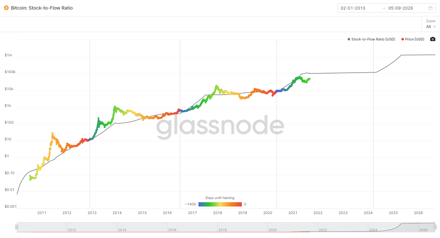
The problem is that everyone who follows Bitcoin knows of this model and now there are big institutions who are invested in the space. Now that sophisticated investors are involved, there is a chance they front-run the cycle or take the other side of the trade.
On-chain analysis helps identify what is really happening underneath the price action. It can provide very valuable information about exactly what type of investor is buying or selling.
One of the distinct advantages that retail investors have with cryptocurrencies is that the data is readily available. This is opposed to the stock market where the stock brokers hold all of the data and are selling it only to hedge funds.
If you take the time to learn the important metrics, you can be almost as well as informed about the underlying blockchain action as a billion dollar hedge fund.
Exchange Net Flow Volume


If you are a long-term HODLer, you want to see exchange net outflows (red (-) on the Glassnode chart). This means that people are moving their coins off an exchange and to cold storage. This effectively is decreasing the liquid supply available.
Glassnode’s Description of Metric
The difference of in volume flowing into exchanges and out of exchanges, i.e. the net flow of coins into/out of exchanges. Note that exchange metrics are based on our labeled data of exchange addresses that we constantly keep updating, as well as data science techniques and statistical information that changes over time. Therefore these metrics are mutable – the data is stable, but especially most recent data points are subject to slight fluctuations as time progresses.
How I use Metric
Something I keep an eye on is if I see a trend in coins starting to accumulate on exchanges. This is telling me that people are getting ready to liquidate their stack. I usually use a 30-day SMA (simple moving average) to help level out the data.
My Current Analysis (September, 2021)
I was getting a little un-easy that the trend was showing a pretty sharp trend upwards in exchange net inflow volume (keep in mind that the absolute number was still negative meaning there was still a net outflow, but the trend was fairly sharp). Luckily, the trend has since reversed. I imagine there was a lot of people like me who have held for several years and took some profits, but now are content with their cash position and are going to HODL the rest (at least for a while).

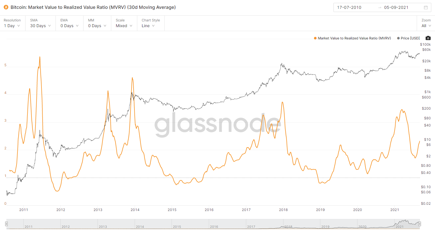
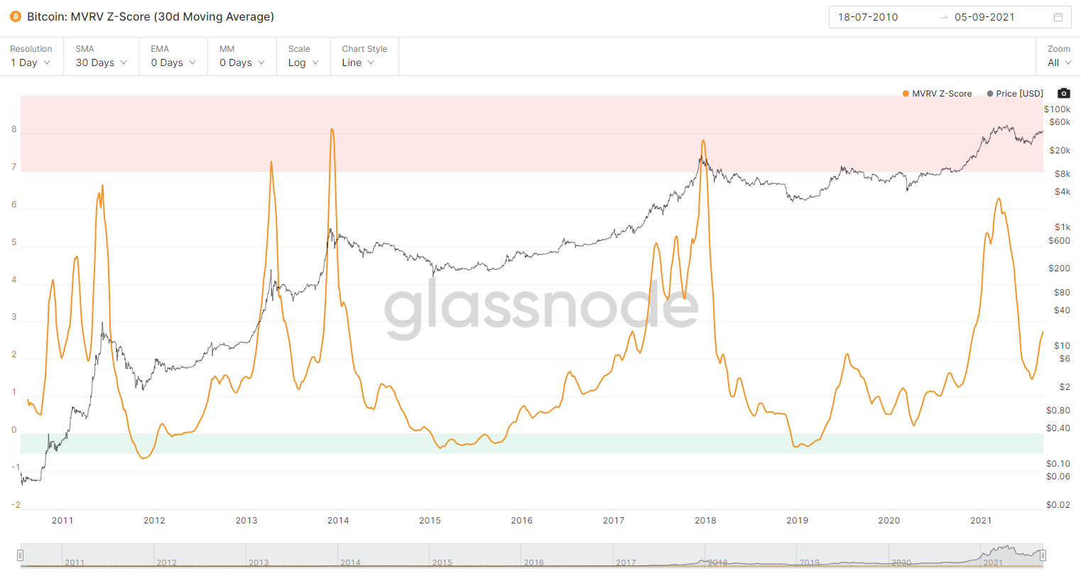
MVRV Z-Score

Glassnode’s Description of Metric
Market Value to Realized Value (MVRV) is the ratio between market cap and realized cap. It gives an indication of when the traded price is below a "fair value". This metric was created by David Puell and Murad Muhmudov. For more information see this post
The MVRV Z-Score is used to assess when Bitcoin is over/undervalued relative to its "fair value". When market value is significantly higher than realized value, it has historically indicated a market top (red zone), while the opposite has indicated market bottoms (green zone).
Technically, MVRV Z-Score is defined as the ratio between the difference of market cap and realized cap, and the standard deviation of market cap, i.e. (market cap – realized cap) / std(market cap).
My Interpretation
MVRV = MV / RV
MV = Market Value = Market Cap (Total supply of coins * Today’s Price)
RV = Realized Value = Realized Cap (Total supply of coins * Price Purchased). Effectively, this is the sum of everyone’s cost basis.
MVRV - Z-Score is just an adjusted version of MVRV
Z-score: A standard deviation test that pulls out the extremes in the data between market value and realized value.
Effectively, MVRV is an average multiplier of the market’s cost basis. For example, if the MVRV is 5, then on average, each coin was bought for 5x less than it is currently trading. (e.g. if BTC = $50k, MVRV = 5, then the average purchase price of each coin is $10k).
How I use Metric
Glassnode has a red-band and green-band that have predicted market tops and bottoms.

I check this chart during bull-runs. When we start getting close to the red-band, I’ll consider taking some profits.
My Current Analysis (September, 2021)
It looks like the sell-off in May has subsided and people are HODLing again. As the price goes back up, the MV is increasing which is causing the MVRV to increase. Based on the MVRV Z-score chart, it looks like there could be a long way to go before we reach another market top.
aSOPR (Adjusted SOPR)

Glassnode’s Description of Metric
Adjusted SOPR is SOPR ignoring all outputs with a lifespan of less than 1 hour.
The Spent Output Profit Ratio (SOPR) is computed by dividing the realized value (in USD) divided by the value at creation (USD) of a spent output. Or simply: price sold / price paid. This metric was created by Renato Shirakashi. For a detailed commentary see this post
Glassnode Video Tutorial of SOPR
My Interpretation
SOPR > 1 (people are selling at a profit)
SOPR < 1 (people are selling at a loss)
aSOPR is just a Glassnode adjustment to ignore coins < 1 hour old
How I use Metric
I like to use SOPR for the bear markets. I think MVRV Z-Score has more accurately timed market tops, but SOPR is a good indicator to tell you market sentiment. If you see SOPR drop below 1, then investors are capitulating and cutting their losses and it is a good time to start adding to your position.
My Current Analysis (September, 2021)
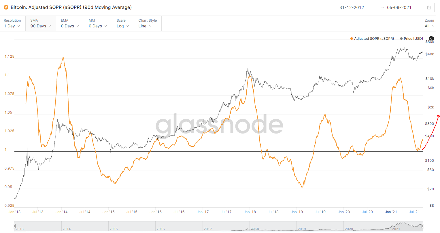
It looks like Bitcoin bounced as soon as SOPR hit 1 on the 90 day SMA. This is a strong indication that the bull market is still in play as aSOPR has broke below 1 in all major bear markets. Based on all the other trends, I would expect aSOPR (as well as BTC price) to continue to rise.
NUPL - Net Unrealized Profit/Loss


Glassnode’s Description of Metric
Net Unrealized Profit/Loss is the difference between Relative Unrealized Profit and Relative Unrealized Loss. For more information see this article. This metric can also be calculated by subtracting realized cap from market cap, and dividing the result by the market cap as described in this article.
My Interpretation
This is similar to MVRV.
MVRV = MV / RV
NUPL = (MV-RV) / MV = (Unrealized Profit or Loss) / MV
MV = Market Value = Market Cap (Total supply of coins * Today’s Price)
RV = Realized Value = Realized Cap (Total supply of coins * Price Purchased). Effectively, this is the sum of everyone’s cost basis.
NUPL is basically a ratio that shows how much un-realized profit or loss the market has compared to the total current market cap.
How I use Metric
NUPL and MVRV tell me very similar things. The shapes of the curves are a bit different, but in effect they are both metrics that identify when people have a lot of profit and might ring the register.

I like using NUPL alongside MVRV Z-Score to predict market tops and bottoms.
My Current Analysis (September, 2021)
A good reason to check both MVRV and NUPL is that the NUPL chart looks like we are much closer to a market top than MVRV or MVRV Z-Score. It still has some room to run, but if we cross NUPL > 0.75, I’ll probably start taking some profits again.
HODL Waves
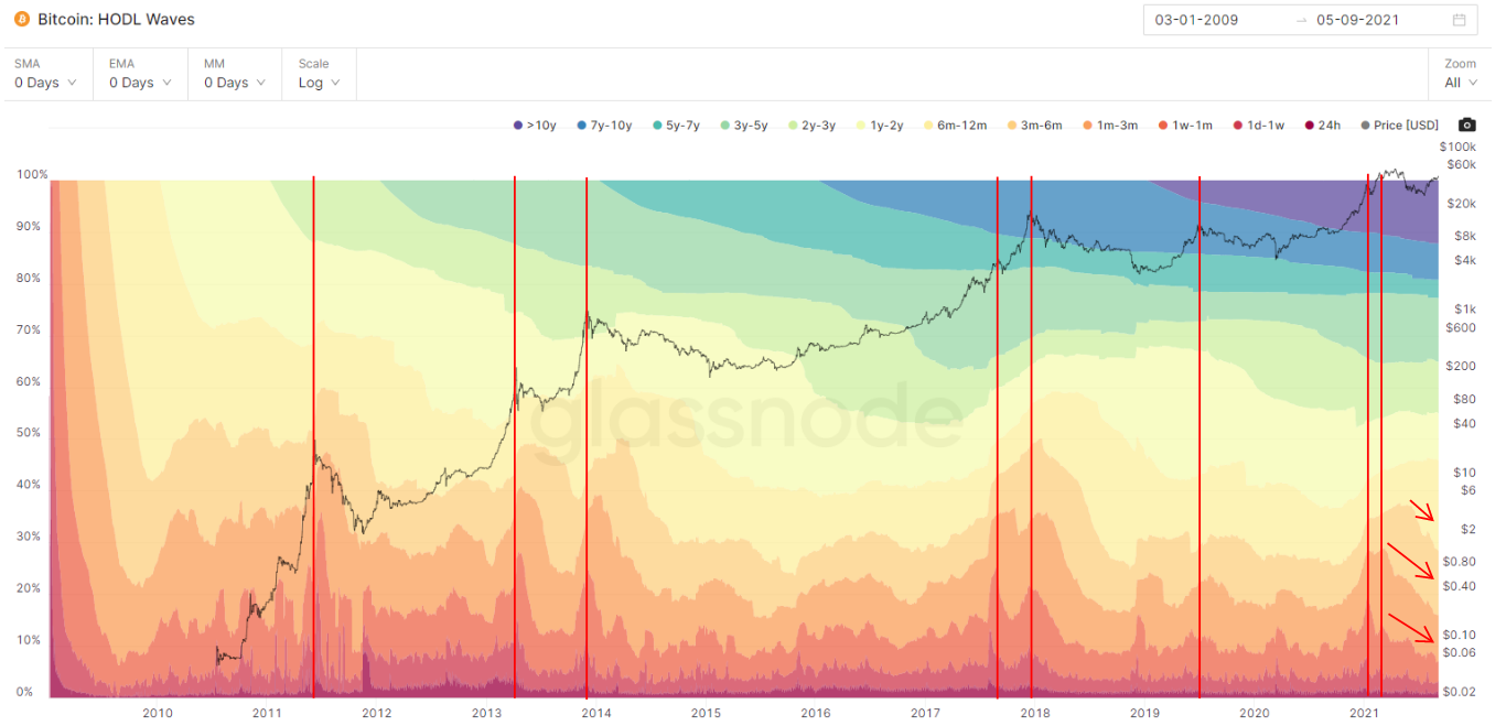
Glassnode’s Description of Metric
Bundle of all active supply age bands, aka HODL waves. Each colored band shows the percentage of Bitcoin in existence that was last moved within the time period denoted in the legend. The concept of HODL waves was first described in this post by Unchained Capital.
Interpretation
If you sum the Y-Axis on the HODL wave chart, you get 100%. The top of the chart (Purple, Blue, Green) shows long term holder percent ownership of all coins moved based on the time on the X-axis. The bottom of the chart (Red, Orange, Yellow) shows the short term holder percent ownership.
Effectively, since the sell-off in May 2020, you can identify a few key trends:
Long term holder percentages are increasing
Short term holder percentages are decreasing
As such, this means the STHs are selling and the LTHs are buying.
How I use Metric
I use this metric to determine the difference in trend between short term and long term holders. Since I am not a T-3 Glassnode subscriber, I can’t filter the other metrics in this post by STH or LTH, but I can check this chart to gauge what is happening.
My Current Analysis (September, 2021)
It appears we are getting close to a bottom in STH percent ownership. As such, this could be the beginning of a new HODL wave where STHs begin to pile back into the market and the STH percent ownership starts increasing again.
What’s surprising is the price has risen as the STH percentage has dropped. This would indicate very strong LTH demand. If STH holders begin to buy, then we could see a dramatic supply squeeze and price increase in BTC.
Realized Cap HODL Waves

Glassnode’s Description of Metric
HODL Waves weighted by Realized Price. The idea for this visualization of HODL waves was first introduced by @typerbole.
How I use Metric
It’s effectively the same metric as HODL waves but it is weighted by realized price. The waves are more dramatic when this is done so it’s easier to spot the trends. Again, I use the HODL waves to identify the behavior between STH and LTHs.
My Current Analysis (September, 2021)
It looks like a new HODL wave might be forming. If it does, the price of BTC should rise dramatically.
Reserve Risk
This metric is a bit more complicated…

Glassnode’s Description of Metric
Reserve Risk is defined as price / HODL Bank. It is used to assess the confidence of long-term holders relative to the price of the native coin at any given point in time. When confidence is high and price is low, there is an attractive risk/reward to invest (Reserve Risk is low). When confidence is low and price is high then risk/reward is unattractive at that time (Reserve Risk is high).
This metric was created by @hansthered. For more information see this article.
Glassnode - Reserve Risk Explained
3 Steps to calculate
Calculate value of coin-days destroyed (VOCDD)
Calculate HODL Bank
Calculate Reserve Risk
3 Steps to calculate
VOCDD=∑(Price [USD]×Supply-Adjusted CDD) (Sum on Daily Basis)
HODL Bank=∑(Price−Median VOCDD) [USD] (Lifetime Cumulative Sum)
Reserve Risk=Price [USD] / HODL Bank
My Interpretation
First you need to understand coin-days-destroyed (CDD). Let’s say 0.5 BTC was in your wallet for 1 year and then you moved it today. That transfer would have destroyed 182.5 coin-days (0.5 BTC * 365 days). This metric captures the weighting of how long the coin was held for. When long term holders transact and move old coins, it makes CDD increase significantly.
CDD = Number of days the coin was held before being moved * QTY of Coin
When the number of CDD starts increasing, it’s a sign that LTHs are selling. However, more and more BTC is mined each day and the supply is increasing. If you were to trend CDD against time, the chart would trend upward. To adjust for this Glassnode uses Supply-Adjusted CDD.
Supply-Adjusted-CDD = Daily Sum of CDD / Circulating Supply
Think about it this way, there are a lot more transactions occurring where there are 20 million coins in circulation vs 10 million coins. If all things were held constant, you would expect 2x the CDD if the circulating supply is 20 million vs 10 million.
VOCDD is weighting CDD by the price of the coin at the time of the transfer. VOCDD is summed on a daily basis and represents the USD value of all Supply-Adjusted CDD each day. Basically, VOCDD increases when the price of the coin increases and when the coin has been held for a long period of time.
VOCDD = Sum (Price * Supply-Adjusted-CDD)
HODL Bank represents the cumulative unspent opportunity cost of the market holding the asset. HODL Bank is calculated as the lifetime cumulative sum of the daily difference between price and the median VOCDD.
HODL Bank = Lifetime cumulative Sum ∑ (Price − MVOCDD)
MVOCDD = 30 Day Simple Moving Average of VOCDD
HODL Bank Units >> USD
Effectively, HODL Bank represents the cumulative conviction of all the HODLers. If the opportunity cost of spending the coin is high, the conviction is high.
Reserve Risk divides the price by HODL Bank
Reserve Risk = Price / HODL Bank
Reserve Risk = Price / Cumulative-Conviction-Of-Market
The reserve risk ratio let’s us know when the price might rise high enough that is makes even the most convicted HODLers sell.
How I use Metric
I use this metric similarly to MVRV and NUPL as it is good for timing market tops and bottoms.
They key differentiator and what makes this metric very important is it is weighted towards long-term-holders. Glassnode requires a T-3 subscription to differentiate between STH and LTH for other metrics, but the reserve risk is weighted towards LTH in its derivation.
Therefore, reserve risk is a great metric for identifying the longevity of a cycle. Some of the other metrics might reach the “red-zone” first because they contain data on STH and LTH.
It’s always good to track what the LTHs are doing because they are the “smart money.”
My Current Analysis (September, 2021)
It still looks like there is a lot of room for reserve risk to to increase before it enters the red zone.

ASOL

Glassnode’s Description of Metric
Average Spent Output Lifespan (ASOL) is the average age (in days) of spent transaction outputs. Outputs with a lifespan of less than 1h are discarded.
My Interpretation
ASOL is the average age of coins being moved on a given day. If you see this number starting to rise, then it means longer term holders are becoming more active.
How I use Metric
It’s a simple metric that is good for reference, but Glassnode has a lot more advanced metrics that are better for timing market tops and bottoms.
Summary
In this lesson I covered the key on-chain metrics and how to analyze and interpret them using data analytic services such as Glassnode.
Exchange Net Flow Volume
MVRV Z-Score
aSOPR
NUPL
HODL Waves
Realized Cap HODL Waves
Reserve Risk
ASOL
Happy HODLing! On-chain data is looking rather bullish.
Reference Material & Social Media
In Lesson 030 I cover how to navigate and utilize the Google Sheet I have built for all WCD lessons. This Google Sheet contains a worksheet for each WCD lesson. Each sheet has all of the Excel calculations, tables, graphs, and charts that I have posted in the respective WCD lesson. Additionally, the Google Sheet has a master “Index” worksheet that has links to all of the content associated with each lesson.
If you found this post helpful, please like, share, and follow me on my social media channels!